23 Outdated Kitchen Trends Designers Are Ditching
Kitchens are more than just places to cook—they’re the emotional and functional heart of the home. And yet, despite their centrality, they’re also among the most trend-driven rooms in the house. What feels fresh and forward-thinking one decade can start to feel tired, cluttered, or even jarring the next. That’s not because those choices were “wrong” at the time, but because design evolves alongside how we live. Today’s kitchens prioritize calm over chaos, cohesion over contrast-for-contrast’s-sake, and intentionality over ornamentation. As a result, many once-popular kitchen features have quietly fallen out of favor—not because they’re inherently bad, but because they no longer serve the way we want our homes to feel.
I recently visited a client’s home that had been beautifully renovated in the late 2000s. Everything was high-quality: custom cabinetry, top-tier appliances, imported stone. But the space felt heavy—visually noisy, emotionally dated. The honey oak cabinets clashed with the beige granite countertops; the overhead fluorescent lights flattened every surface; the tiny mosaic backsplash was a minefield of grout lines. It wasn’t unloved—it was simply stuck in a design era that no longer resonated. That experience crystallized something important: updating a kitchen isn’t always about gutting it. Sometimes, it’s about recognizing which elements are holding the space back from feeling truly current, calm, and connected to modern life.
Today’s leading designers aren’t chasing novelty for its own sake. Instead, they’re thoughtfully retiring outdated conventions that prioritize aesthetics over experience. They’re replacing visual clutter with breathing room, gimmicks with grace, and sameness with soulful individuality. This shift reflects a broader cultural move toward mindful living—spaces that support presence, not performance.
Below, we explore 23 kitchen trends that designers are actively moving away from—and what they’re choosing instead. This isn’t a judgment on past choices (many of these were considered “best practice” just a decade ago!), but a guide to creating kitchens that feel timeless, functional, and deeply aligned with how we live now.
1. Honey Oak Cabinets
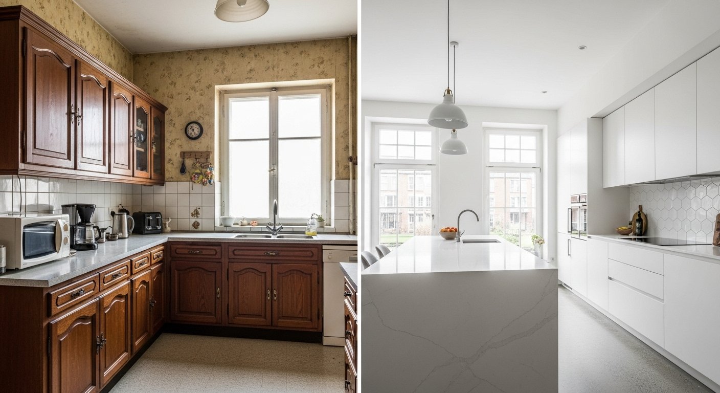
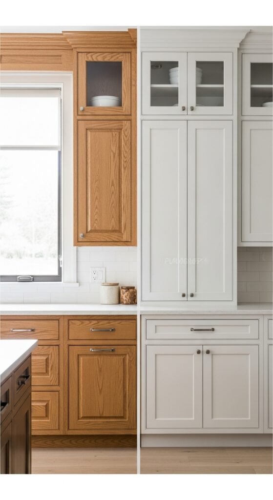
Once the default finish for suburban tract homes, honey oak—with its orange undertones, pronounced grain, and glossy polyurethane sheen—now reads as visually overwhelming and stylistically dated. Its warm-but-muddy tone clashes with today’s cooler, more neutral palettes and competes with clean-lined furniture and finishes. Designers are increasingly painting over or replacing these cabinets with matte or satin finishes in soft whites, warm greys, greiges, or even deep charcoals. These updated colors create a serene backdrop that lets architecture, lighting, and curated objects take center stage—without the visual static of busy wood grain.
Visual: Full kitchen view showing outdated honey oak cabinets contrasted with a modern alternative in soft white paint.
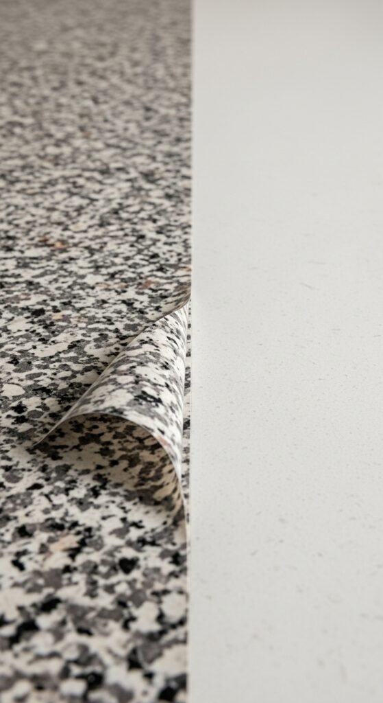
2. Beige “Santa Fe” Granite
That swirly beige granite with brown, gold, and burgundy flecks—often marketed as “Santa Fe” or “New Venetian Gold”—was ubiquitous in the 2000s. While durable, its chaotic pattern and dated color scheme now scream “builder basic.” It fights rather than complements minimalist cabinetry and creates a sense of visual fatigue. Contemporary designers favor quieter, more consistent surfaces: honed marble with subtle veining, matte-finish quartzite, concrete-look porcelain slabs, or even terrazzo with restrained aggregate. The goal is texture without turbulence—surfaces that enhance, not distract.
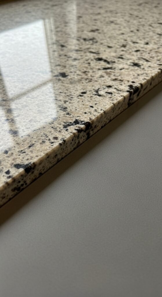
Visual: Close-up of beige granite countertop next to a sleek, minimalist quartz surface for comparison.
3. Overhead Fluorescent Lighting
Harsh, shadowless fluorescent ceiling panels cast an unforgiving, institutional glow that drains warmth from food, skin tones, and materials alike. They flatten dimension and make even beautiful spaces feel sterile. Modern kitchens embrace layered lighting strategies: recessed LED downlights for general illumination, under-cabinet strips for task lighting, and sculptural pendants or linear fixtures over islands for ambiance and focal points. The result is light that’s adaptable, flattering, and human-centered—supporting both cooking and connection.
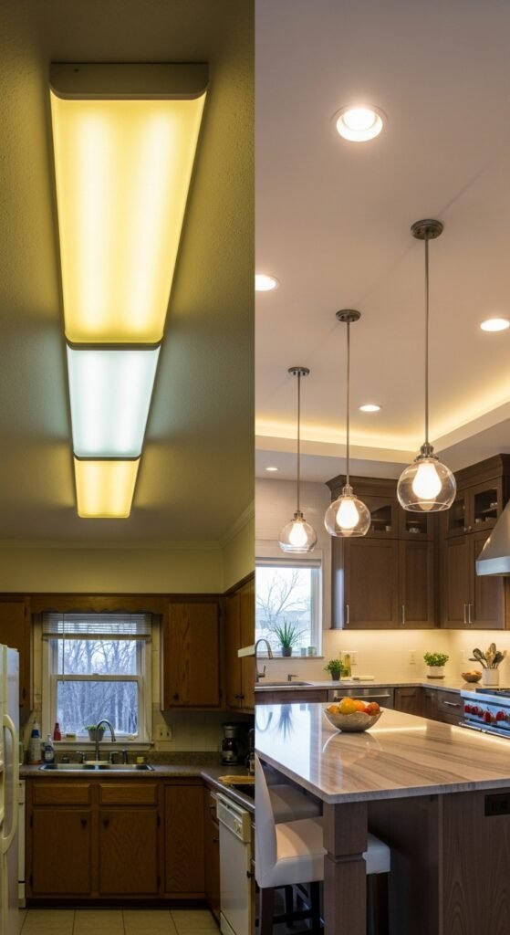
Visual: Kitchen with outdated fluorescent ceiling fixtures vs. layered lighting with pendants and under-cabinet LEDs.
4. Tile Backsplashes with Excessive Grout Lines
Tiny mosaic tiles—especially in subway or penny formats—may seem charming in theory, but in practice, their dense grout lines trap grease, discolor over time, and require constant scrubbing. More importantly, they create visual fragmentation in a space that benefits from calm continuity. Designers now opt for large-format tiles (12×24” or larger), full-height slab backsplashes that match or complement countertops, or seamless glass or metal panels. These solutions eliminate grout entirely or minimize it to near-invisibility, making cleaning effortless and aesthetics serene.
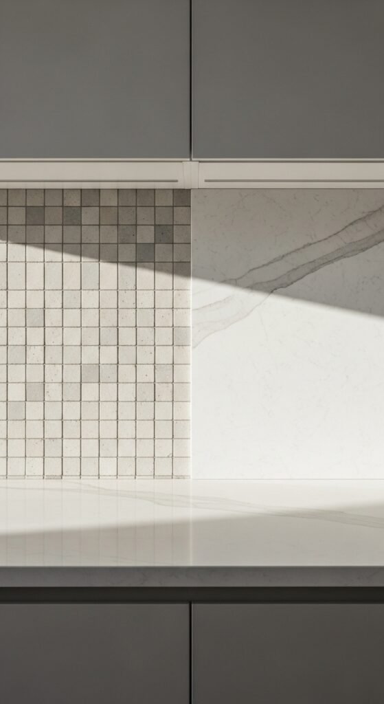
Visual: Full-wall view of a kitchen with small mosaic tile backsplash versus a clean slab backsplash.
5. Stainless Steel Appliance Overload
Stainless steel appliances aren’t obsolete—but the all-stainless kitchen, where fridge, range, microwave, dishwasher, and hood all gleam in identical metal, now feels cold, clinical, and impersonal. It lacks warmth and fails to integrate the kitchen into the home’s overall aesthetic. The modern approach uses panel-ready refrigerators and dishwashers that blend seamlessly with cabinetry, matte black ranges for dramatic contrast, or even custom-colored appliances in muted tones like sage, navy, or cream. The kitchen becomes a room, not a showroom.
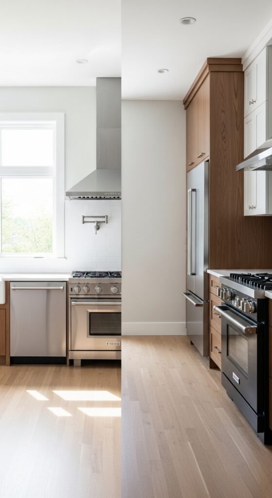
Visual: Kitchen with all-stainless appliances compared to one with integrated panel fridge and matte black range.
6. Decorative Cabinet Trim (Roped Molding, Arched Inserts)
Ornate cabinet doors featuring faux arches, rope detailing, raised panels, or beveled glass inserts were hallmarks of early-2000s “traditional” design. Today, they read as fussy and visually heavy. Modern cabinetry favors simplicity: flat-panel (slab) or Shaker-style doors with clean lines and minimal profiles. Hardware—not carvings—adds personality. This shift allows proportion, material, and spatial rhythm to carry the design narrative, resulting in kitchens that feel lighter and more architectural.
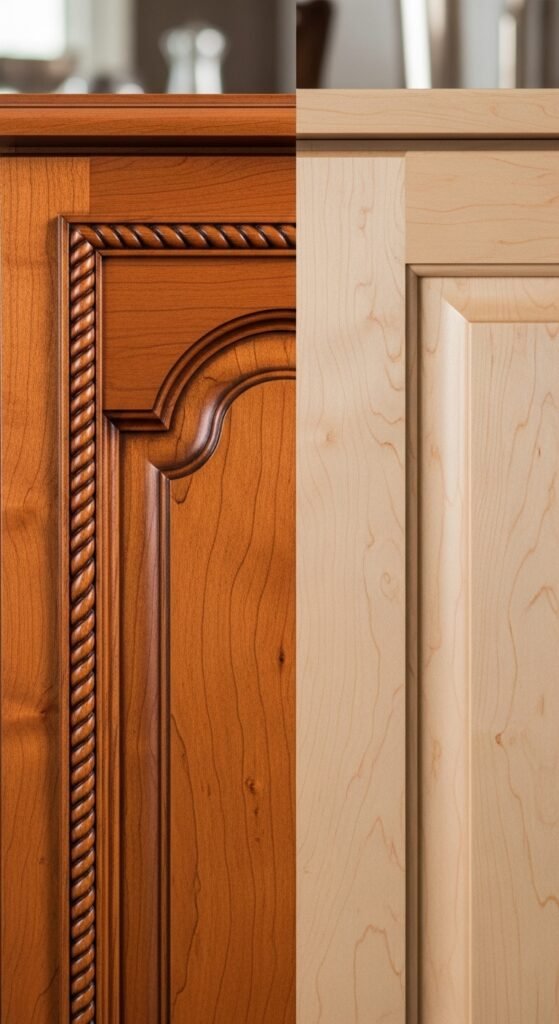
Visual: Close-up of ornate cabinet door with decorative trim beside a clean Shaker-style alternative.
7. Themed Kitchens (Tuscan, Country French, etc.)
Full-on design themes—complete with terracotta tiles, wrought iron racks, vineyard murals, rooster motifs, or checkerboard floors—once promised charm but now feel costume-like and inauthentic. They lock a space into a narrow aesthetic that rarely ages well. Today’s designers prefer subtle, global-inspired touches: a hand-thrown ceramic bowl, a woven fruit basket, or olive oil cruet on the counter. The mood is evoked, not declared—allowing the kitchen to feel personal without being theatrical.
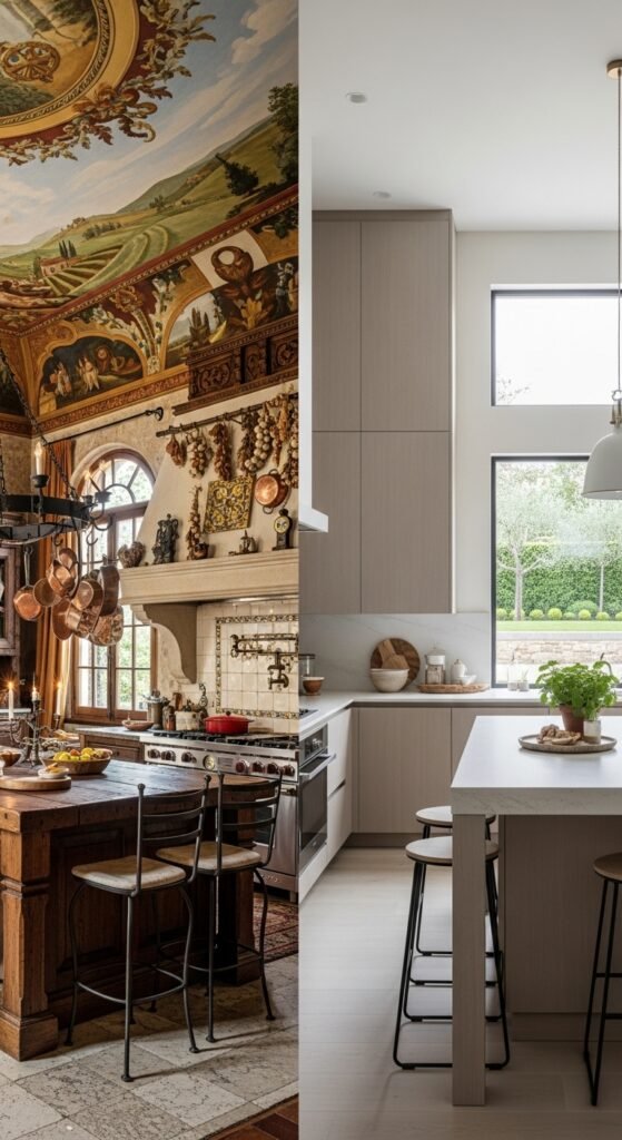
Visual: Over-the-top Tuscan-themed kitchen with murals and wrought iron vs. a restrained, modern interpretation.
8. Built-In Desk Nooks
The “command center” desk tucked between upper and lower cabinets promised organization but often became a magnet for clutter—mail, school forms, coupons, and random gadgets. In open-plan homes, it also disrupted flow and visual calm. Modern solutions include dedicated mudroom zones, smart pantry tech stations with charging docks, or slim pull-out desks hidden within cabinetry. The emphasis is on functionality without sacrificing serenity.
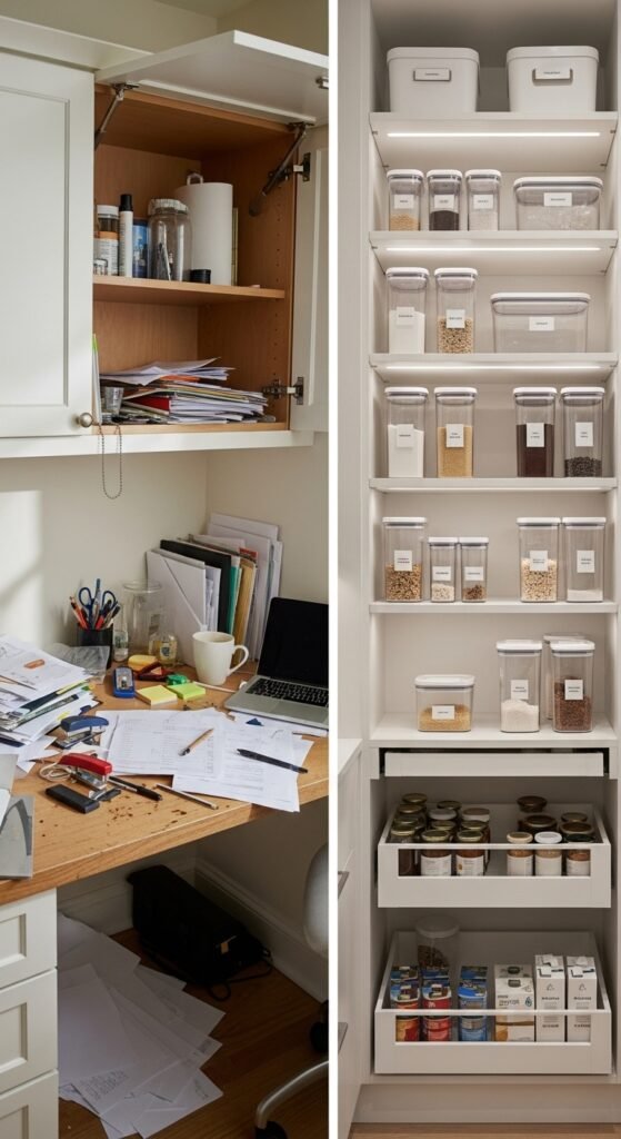
Visual: Cluttered built-in kitchen desk nook versus a clean pantry with smart storage.
9. Glass-Front Upper Cabinets Everywhere
While a single glass-front cabinet can beautifully showcase curated dishware or vintage glassware, lining every upper cabinet with glass creates visual busyness and exposes everyday clutter. Designers now limit glass fronts to one or two strategic locations—or skip them entirely in favor of solid doors that promote a calmer, more edited look. When used, glass is often paired with interior lighting to elevate display pieces without overwhelming the space.
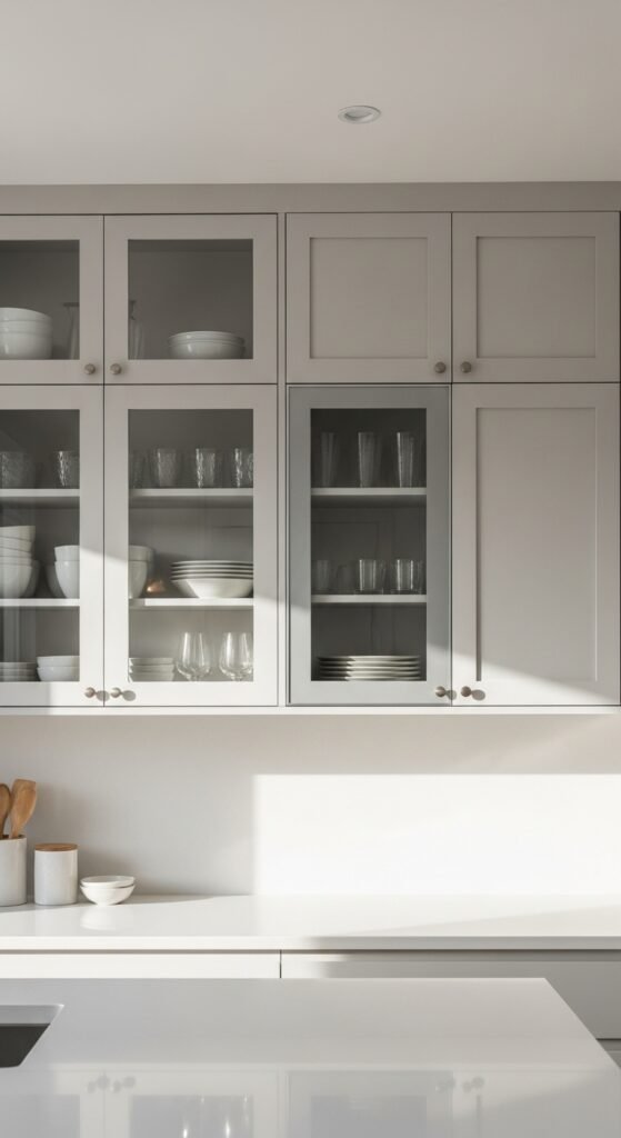
Visual: Kitchen with all glass-front uppers vs. one accent glass cabinet amid solid doors.
10. Pop-Up Outlets in Countertops
These motorized, spring-loaded outlets seemed futuristic when they debuted—but in reality, they’re prone to mechanical failure, collect crumbs in their seams, and disrupt the clean lines of a countertop. Modern kitchens integrate outlets more discreetly: along the backsplash in matching finishes, inside drawers with USB ports, or via wireless charging surfaces. The goal is to keep counters clear and tech invisible until needed.
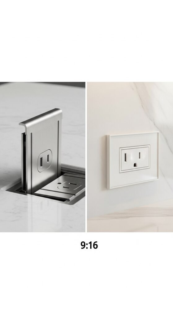
Visual: Close-up of pop-up outlet mechanism in countertop vs. sleek integrated outlet in backsplash.
11. Colored Appliances as Statement Pieces
Boldly colored ranges or refrigerators—think cherry red, turquoise, or butter yellow—were popularized by retro brands and once symbolized personality. But as standalone “art pieces,” they often clash with evolving decor and quickly date a space. Today’s designers achieve color through more flexible means: painted cabinets, vibrant tile accents, or textiles. Appliances remain neutral, ensuring longevity and cohesion.
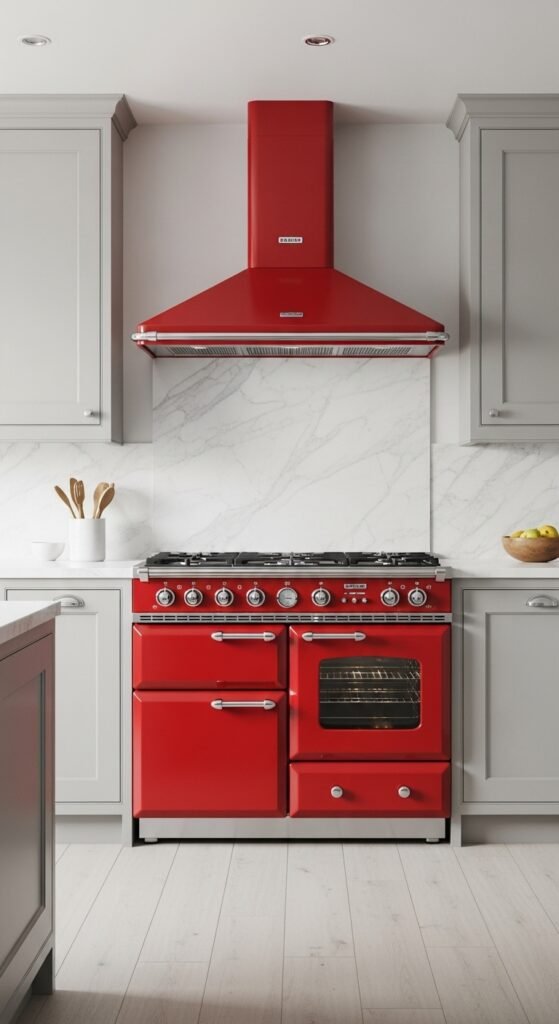
Visual: Bright red retro-style range in a neutral kitchen looking jarring.
12. Overhead Pot Racks
Hanging copper pots from ceiling-mounted racks may look romantic in films, but in real life, they collect dust, block light, clang together when bumped, and make ceilings feel lower. Cookware is now stored in deep, pull-out drawers with custom dividers or in appliance garages—accessible, tidy, and out of sight. The kitchen remains open and airy, not cluttered with suspended hardware.
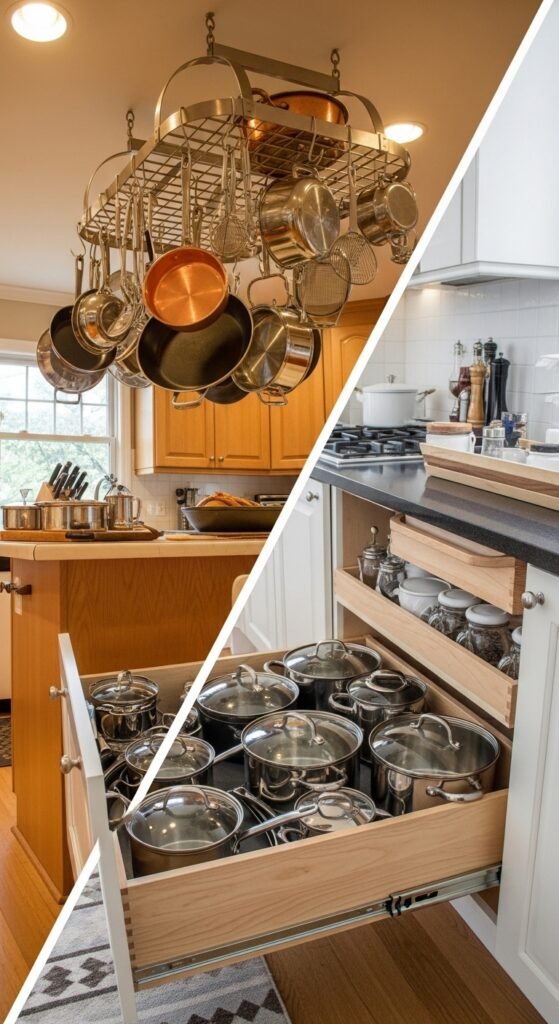
Visual: Ceiling-mounted pot rack cluttering kitchen vs. organized pull-out cookware drawer.
13. Wallpapered Accent Walls
Vinyl or peel-and-stick wallpaper with fruit prints, florals, or geometric patterns was once a quick way to add “personality.” But in humid, high-use kitchens, it peels, stains, and yellows rapidly. Modern accent walls use durable, washable materials: textured plaster (like tadelakt or venetian), vertical wood slats, fluted paneling, or a single bold paint color in a scrubbable finish. These options offer depth without fragility.
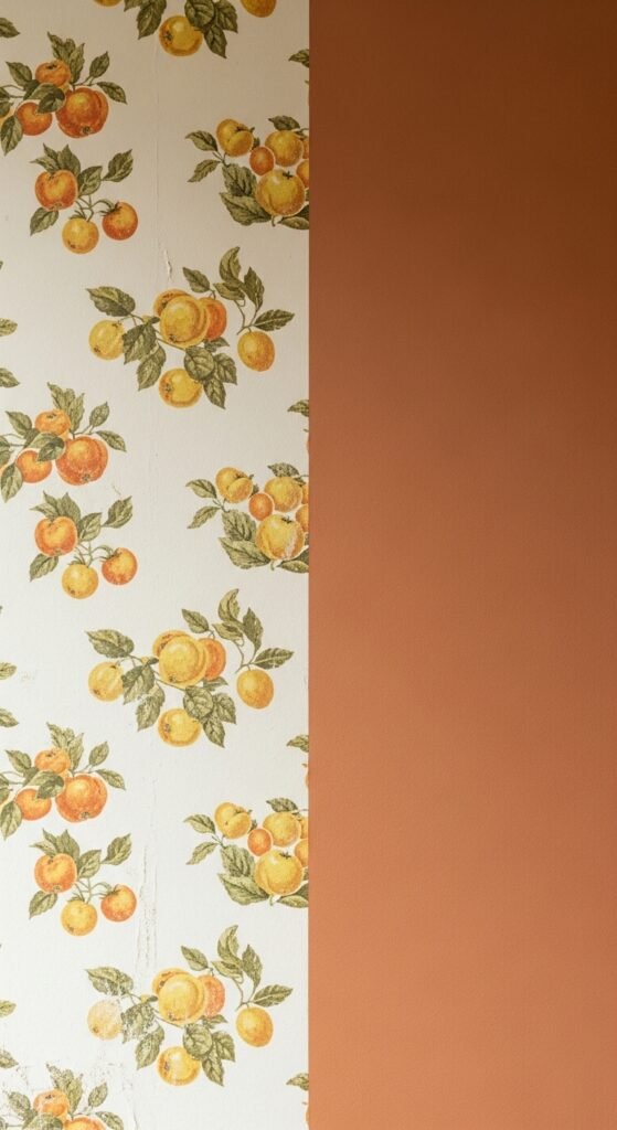
Visual: Faded fruit-pattern wallpaper in kitchen vs. smooth clay-paint accent wall.
14. Dual-Tone Cabinets Done Poorly
Two-tone kitchens aren’t outdated—but when executed with clashing hues (e.g., navy lowers + mint uppers) or without balance, they feel chaotic rather than curated. The modern approach uses tonal contrasts within the same family (warm white + soft greige), limits color to the island only, or uses material contrast (wood island + painted perimeter). Restraint is key.
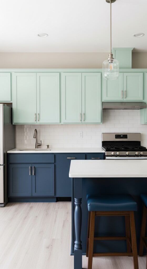
Visual: Jarring dual-tone kitchen with mismatched hues vs. harmonious tonal variation.
15. Fake Granite Contact Paper
A budget-friendly hack that rarely ages well. Bubbling edges, peeling corners, and unrealistic printed patterns make this shortcut obvious and temporary. Even affordable laminates and quartz options now mimic natural stone convincingly—with realistic movement, depth, and durability—making contact paper unnecessary.
Visual: Peeling contact paper on countertop edge vs. seamless budget-friendly quartz.
16. Overstuffed Open Shelving
Open shelves began as a breath of fresh air—a rebellion against closed cabinets. But when every shelf is packed with mismatched mugs, spice jars, and random gadgets, they create visual noise and demand constant tidying. The evolved approach: edit ruthlessly. Display only what’s beautiful or used daily. Leave negative space. Let shelves feel intentional, not incidental.
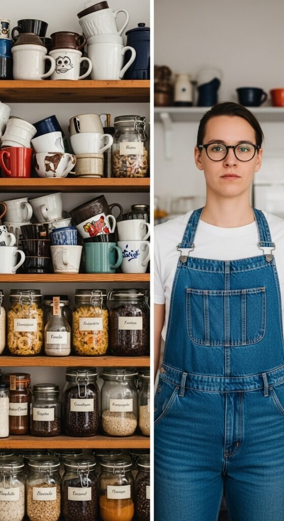
Visual: Cluttered open shelves vs. minimalist styled shelves with curated items.
17. Track Lighting Over Islands
Industrial-style track lighting feels harsh and commercial in residential settings. It casts uneven pools of light and draws attention to hardware rather than food or faces. Slim, linear pendants, adjustable recessed spots, or sculptural single fixtures now provide focused, flattering illumination that enhances both function and mood.
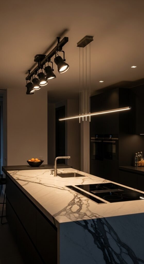
Visual: Kitchen island under bulky track lighting vs. elegant linear pendant setup.
18. Plastic Laminate Countertops with Visible Edges
While laminate has improved dramatically, thick, rounded plastic edges still scream 1990s rental. Modern laminates use square or beveled edges, integrated sinks, or are paired with wood, metal, or concrete accents to elevate the look. The finish is crisp, not cartoonish.
Visual: Close-up of rounded plastic laminate edge vs. square-edge laminate with wood trim.
19. Breakfast Bars with Stools Facing the Wall
Tucking stools against a wall-backed counter isolates diners and cuts off interaction with the rest of the home. It feels utilitarian, not social. Designers now float islands or orient seating toward views, conversation zones, or cooking areas—encouraging connection and engagement.
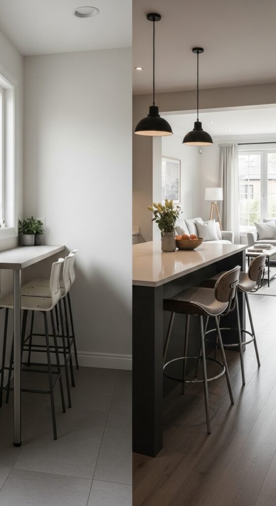
Visual: Awkward breakfast bar with stools facing blank wall vs. open island with social seating.
20. Overuse of Wrought Iron Hardware
Wrought iron pulls and knobs—with their heavy scrolls and dark finishes—were everywhere in the 2000s. Today, they clash with streamlined aesthetics. Brushed brass, matte black, unlacquered brass, or even leather-wrapped handles offer warmth with restraint and align with contemporary material palettes.
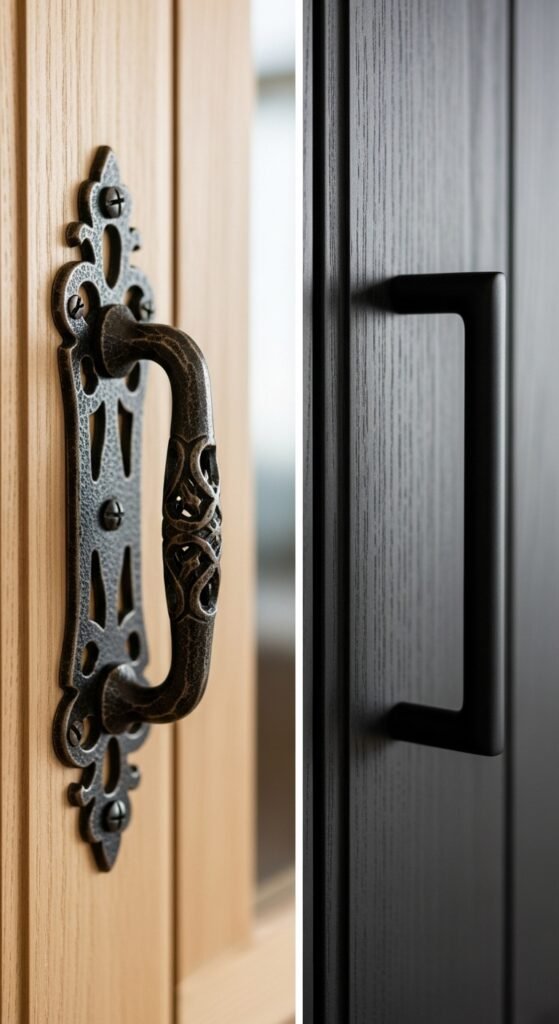
Visual: Ornate wrought iron cabinet hardware vs. minimalist matte black handles.
21. Fake Wood Beam Ceilings
Hollow Styrofoam or PVC “wood” beams added faux rustic charm but often looked cheap and disconnected from a home’s actual architecture. Real reclaimed wood beams (or none at all) are preferred for authenticity. If drama is desired, designers use painted beams or minimalist linear lighting instead.
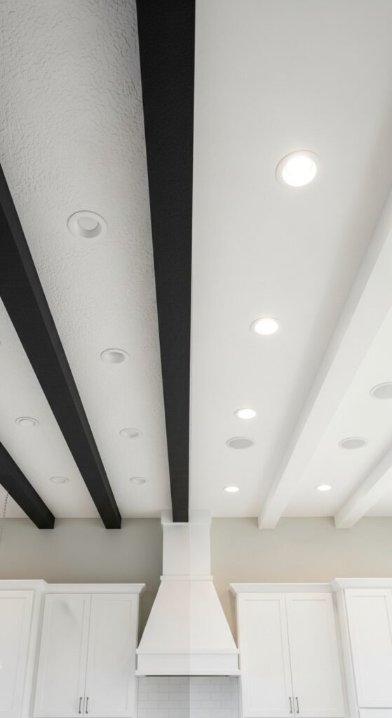
Visual: Fake foam ceiling beams in kitchen vs. clean ceiling or real wood beam.
22. Too Many Small Appliances on Countertops
Blenders, toasters, coffee makers, air fryers, stand mixers—when left out, they fragment the visual flow and make cleaning difficult. Modern kitchens prioritize hidden appliance garages, pull-out pantries with dedicated zones, or designated “coffee stations” that can be closed off. Counters stay clear 90% of the time, promoting calm and ease.
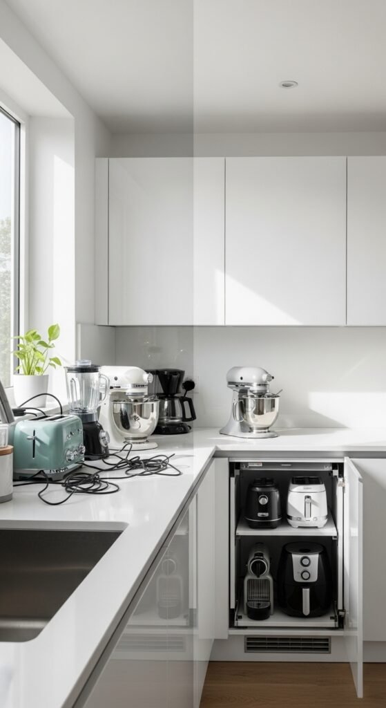
Visual: Crowded countertop with multiple appliances vs. clean counter with hidden appliance storage.
23. Matching Everything Perfectly
The “matchy-matchy” kitchen—where cabinets, flooring, and countertops are pulled from the same sample board—feels sterile and showroom-like. It lacks soul. Today’s designers intentionally mix materials: warm wood with cool stone, matte with gloss, rough with smooth. Contrast creates depth, interest, and a sense of layered living.
Visual: Monotonous all-matching kitchen vs. thoughtfully layered material mix.
Letting go of outdated kitchen trends isn’t about chasing what’s new—it’s about making space for what truly serves you. A kitchen that feels calm, functional, and quietly beautiful doesn’t need gimmicks. It needs clarity, cohesion, and care. And sometimes, that means saying goodbye to the honey oak, the mosaic grout, and the overhead pot rack—not because they’re “wrong,” but because your life has evolved beyond them.
Your kitchen should reflect how you live now: connected, uncluttered, and deeply human. And that’s a trend that never goes out of style.