24 How to Choose a Color Palette That Always Works
Choosing colors for your home can feel surprisingly overwhelming. A paint swatch that looked perfect in the store suddenly feels too cold, too dark, or completely disconnected from the rest of the room. The secret designers know is that beautiful spaces rarely happen by accident. They follow simple color principles that create harmony, balance, and flow.
The best color palettes aren’t necessarily trendy—they’re thoughtfully layered. A successful palette combines foundational neutrals, supporting tones, and a few carefully chosen accents that work together naturally. Whether you’re decorating a single room or an entire home, understanding how colors interact can help you create spaces that feel polished, timeless, and effortlessly cohesive.
These designer-approved tips will help you choose a color palette that always works, no matter your decorating style.
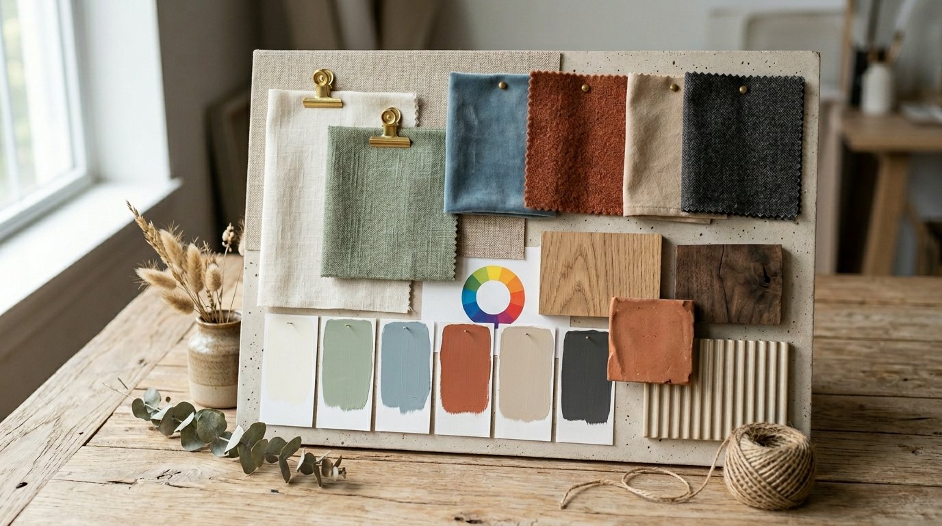
1. Start with a Color You Already Love
The easiest way to create a successful color palette is by beginning with a color you genuinely enjoy living with. This could come from a favorite rug, artwork, throw pillow, or even a piece of clothing that consistently makes you happy.
Designers often build entire rooms around one beloved color because it naturally creates a space that feels personal and authentic. Once you identify your anchor color, select complementary shades that support rather than compete with it.
Styling Tip: Pull two or three additional colors directly from artwork for an instantly cohesive palette.
2. Follow the 60-30-10 Rule
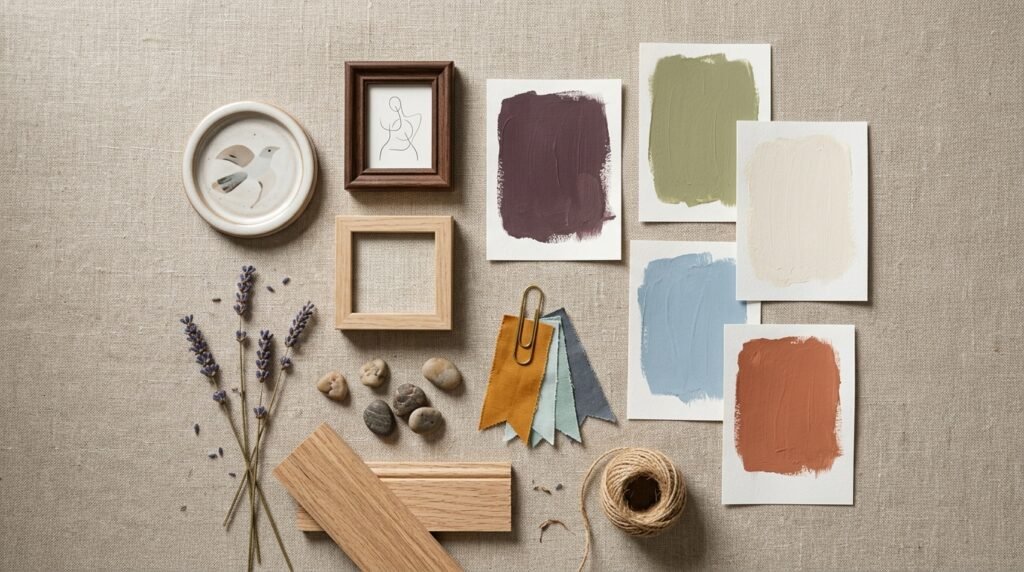
One of the most reliable color rules in interior design is the 60-30-10 formula. Sixty percent of the room uses a dominant color, thirty percent features a secondary color, and ten percent becomes the accent color.
This creates visual balance while preventing any one shade from overwhelming the space. The formula works equally well in modern, traditional, and eclectic homes.
Styling Tip: Use your boldest color as the 10% accent rather than the dominant shade.
3. Build Around Existing Furniture
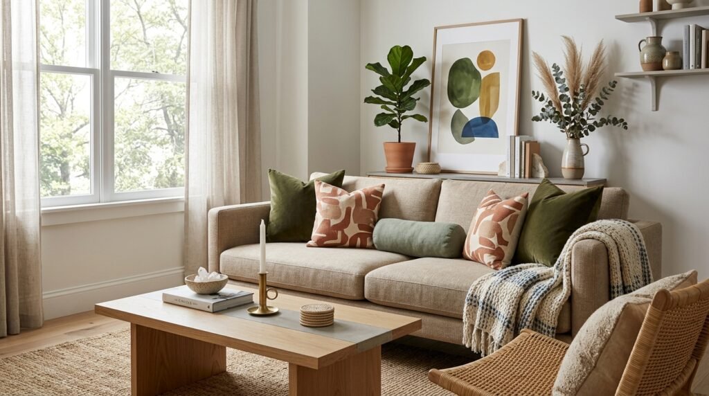
Large furniture pieces are often expensive to replace, making them the perfect starting point for your color palette. A sofa, dining table, or bed frame can help guide paint colors, textiles, and accessories.
Designers frequently work backward from existing pieces to ensure every new element feels intentional and cohesive.
Styling Tip: Identify the undertones in your furniture before selecting paint colors.
4. Use Nature as Your Inspiration
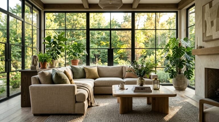
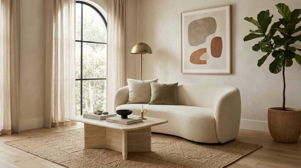
Nature provides some of the most harmonious color combinations available. Think sandy beige paired with ocean blue, sage green with warm brown, or charcoal stone mixed with soft cream.
Natural palettes feel timeless because they mirror combinations our eyes already find comfortable and balanced.
Styling Tip: Use landscape photos as color palette references.
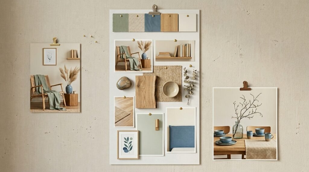
5. Limit Your Palette to Three Main Colors
Too many colors can make a room feel chaotic. Designers typically rely on two or three primary colors and then vary shades, tones, and textures within those colors.
This creates depth without sacrificing cohesion.
Styling Tip: Let texture add variety instead of introducing more colors.
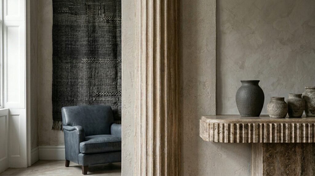
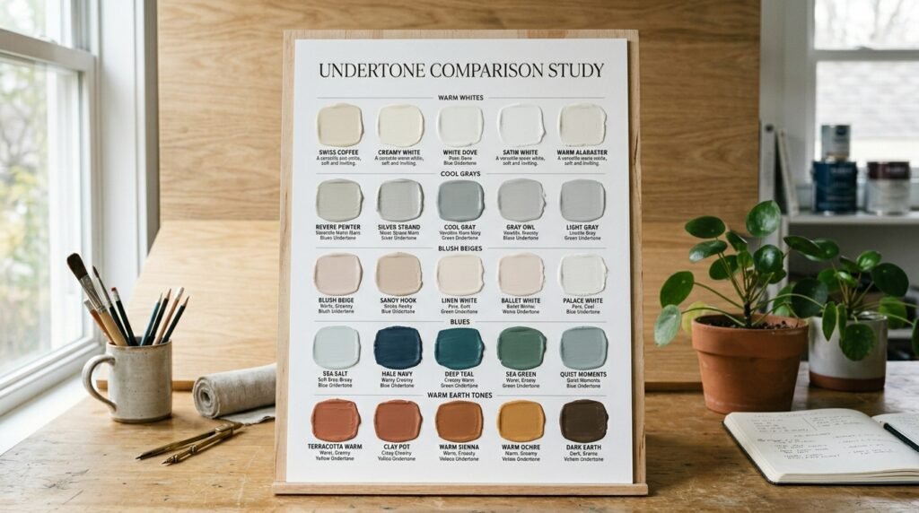
6. Choose Undertones Carefully
Undertones can make or break a color palette. Two shades of beige may look similar until one reveals pink undertones and the other leans yellow.
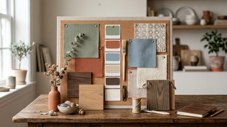
Designers always compare colors side-by-side to ensure undertones work together.
Styling Tip: Examine colors in both daylight and evening light.
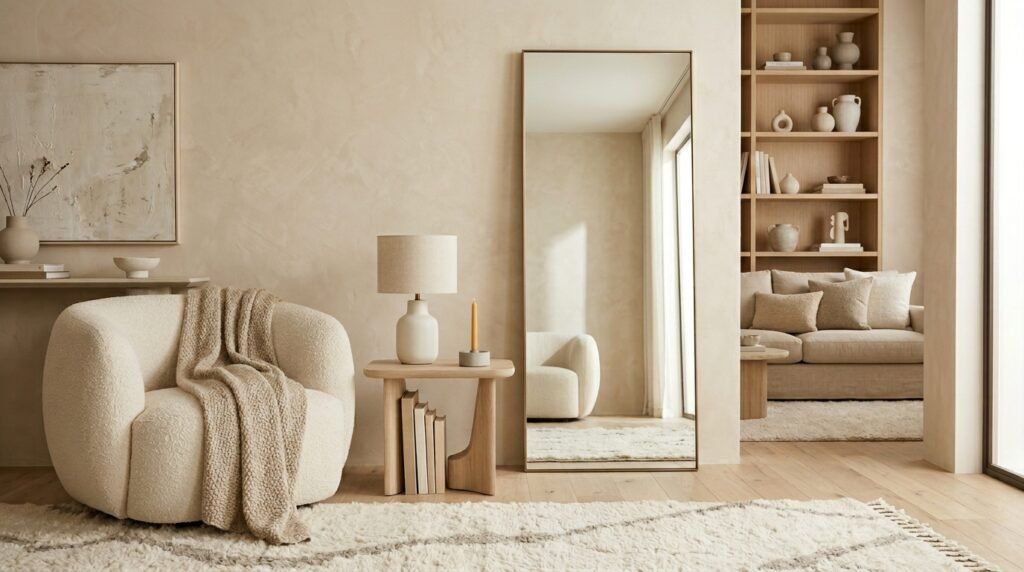
7. Start with Neutral Foundations
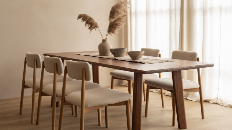
Neutral walls, large furniture, and flooring provide flexibility while making accent colors feel more impactful.
Designers often treat neutrals as the foundation that supports the rest of the palette.
Styling Tip: Layer several neutral shades rather than relying on a single tone.
8. Use Accent Colors Sparingly
Accent colors have more impact when used intentionally. A few carefully placed accessories can completely transform a room without overwhelming it.
Designers often repeat accent colors in small doses throughout a space for consistency.
Styling Tip: Repeat an accent color three times throughout the room.
9. Create Contrast for Balance
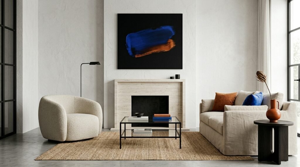
Contrast keeps color palettes from feeling flat. Light and dark shades working together create depth and visual interest.
Styling Tip: Pair light walls with darker furniture for balance.
10. Consider Natural Light First
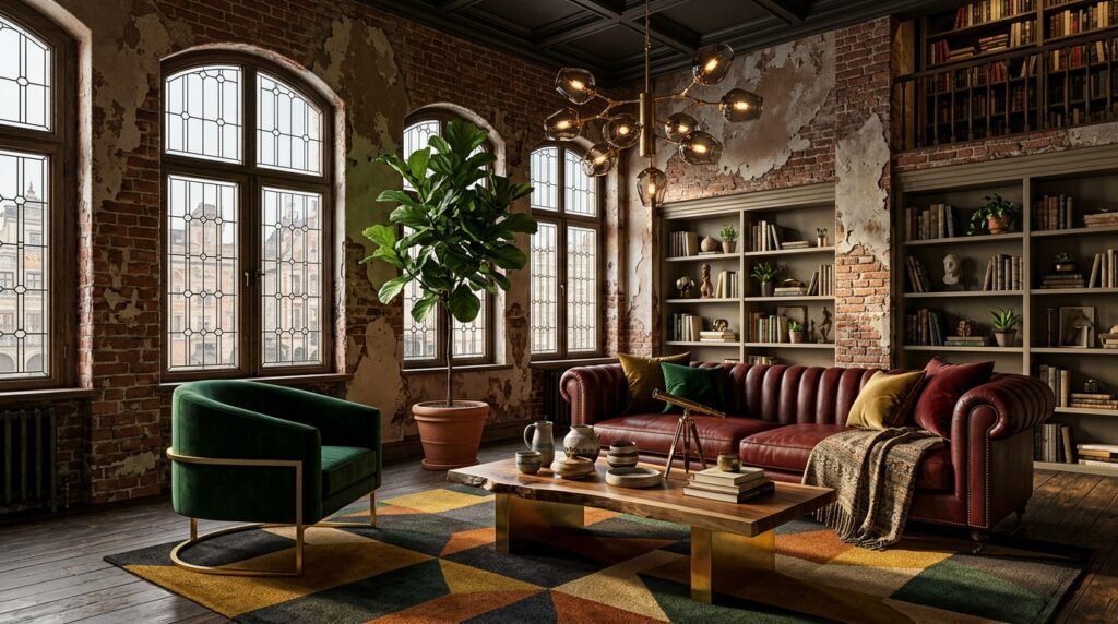
Light dramatically affects how colors appear. A north-facing room may make colors appear cooler, while south-facing rooms often enhance warmth.
Styling Tip: Test colors on multiple walls before deciding.
11. Repeat Colors Throughout the Room
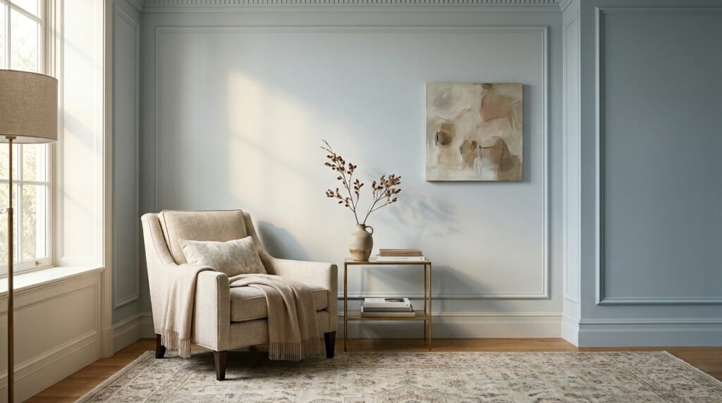
Repeating colors helps guide the eye naturally through a space and creates cohesion.
Styling Tip: Carry one accent color into pillows, artwork, and accessories.
12. Mix Warm and Cool Tones Thoughtfully
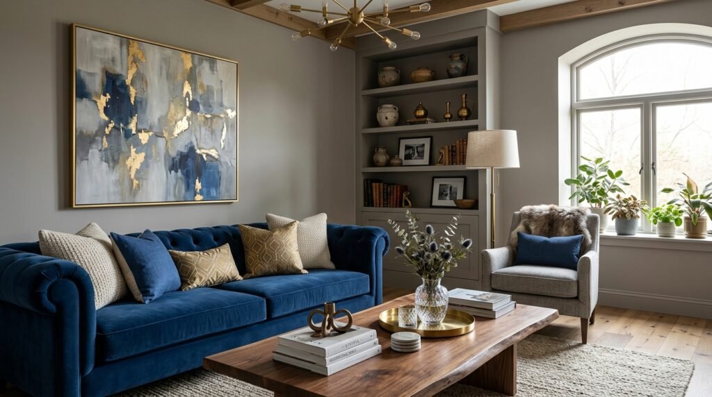
Rooms feel more dynamic when warm and cool tones are balanced correctly. Warm woods can soften cool gray walls, while blue accents can refresh warm beige spaces.
Styling Tip: Let one temperature dominate while the other supports.
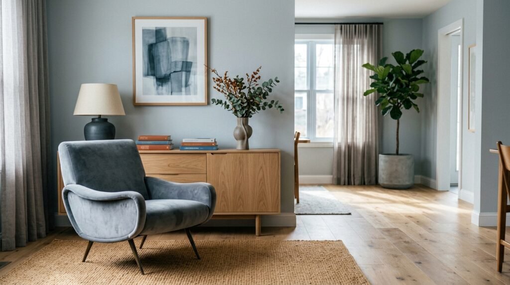
13. Test Colors Before Committing
Even beautiful paint colors can look different in your home. Designers always sample colors before making final decisions.
Styling Tip: Paint large test swatches instead of relying on tiny samples.
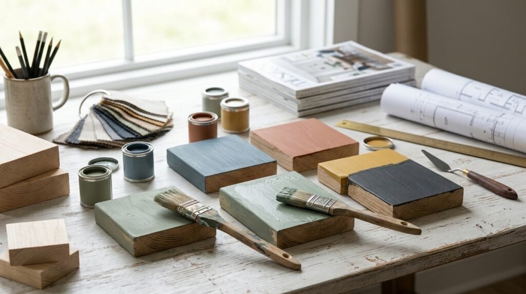
14. Think About the Mood You Want
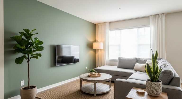
Every color palette creates a feeling. Soft greens feel calming, blues feel fresh, warm neutrals feel cozy, and dark colors feel dramatic.
Designers begin with mood before choosing colors because atmosphere ultimately matters more than trends.
Styling Tip: Choose colors based on how you want the room to feel every day.
Conclusion
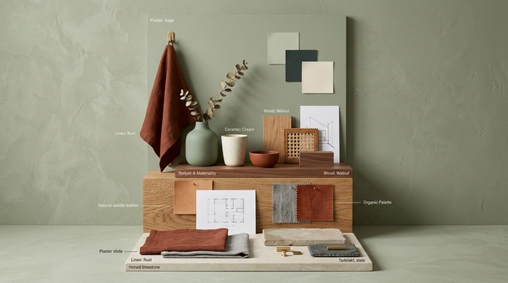
Learning how to choose a color palette that always works isn’t about memorizing complicated design rules. It’s about creating balance, understanding undertones, using contrast thoughtfully, and building a palette that supports the mood you want your home to have.
The most successful interiors often use fewer colors than people expect, relying on texture, repetition, and thoughtful layering to create depth and interest. By starting with colors you love and following a few designer-approved principles, you can confidently create rooms that feel cohesive, timeless, and beautifully personal.
A well-chosen color palette becomes the foundation for every other design decision—and when the palette works, the entire room feels effortless.