22 Color Palettes Dominating Home Decor Right Now
Color trends shape the way our homes feel. They influence mood, define style, and often set the tone for entire interiors. While timeless neutrals remain popular, today’s most sought-after color palettes go beyond basic beige, blending warmth, depth, and personality in ways that feel both fresh and livable.
The newest home decor palettes draw inspiration from nature, vintage design, luxury hospitality spaces, and modern organic interiors. Earthy greens, warm browns, muted blues, rich terracottas, and sophisticated neutrals are replacing colder tones and creating homes that feel more welcoming and layered.
Whether you’re planning a complete redesign or simply looking for fresh decorating inspiration, these color palettes are currently dominating home decor and shaping some of the most beautiful interiors today.
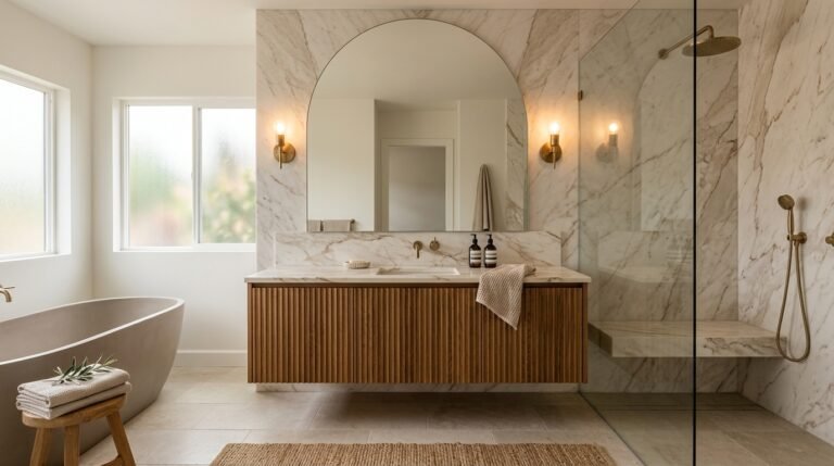
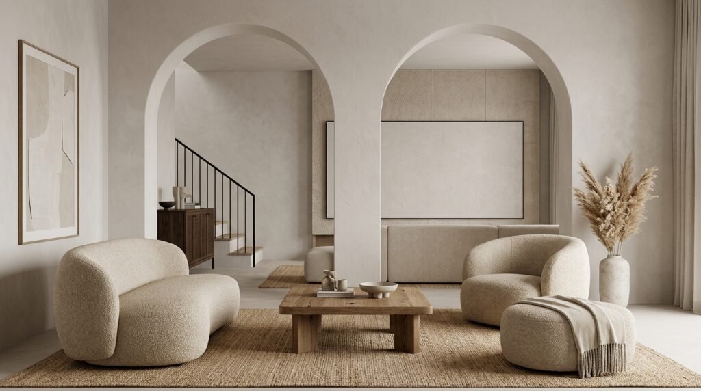
1. Warm Beige and Soft White
This palette continues to dominate interiors because it creates a calm and welcoming atmosphere. Warm beige adds depth while soft white keeps spaces bright and airy.
The combination works beautifully in living rooms, bedrooms, and open-concept homes where a timeless foundation is desired.
Styling Tip: Layer multiple shades of beige to create richness and dimension.
2. Sage Green and Natural Wood
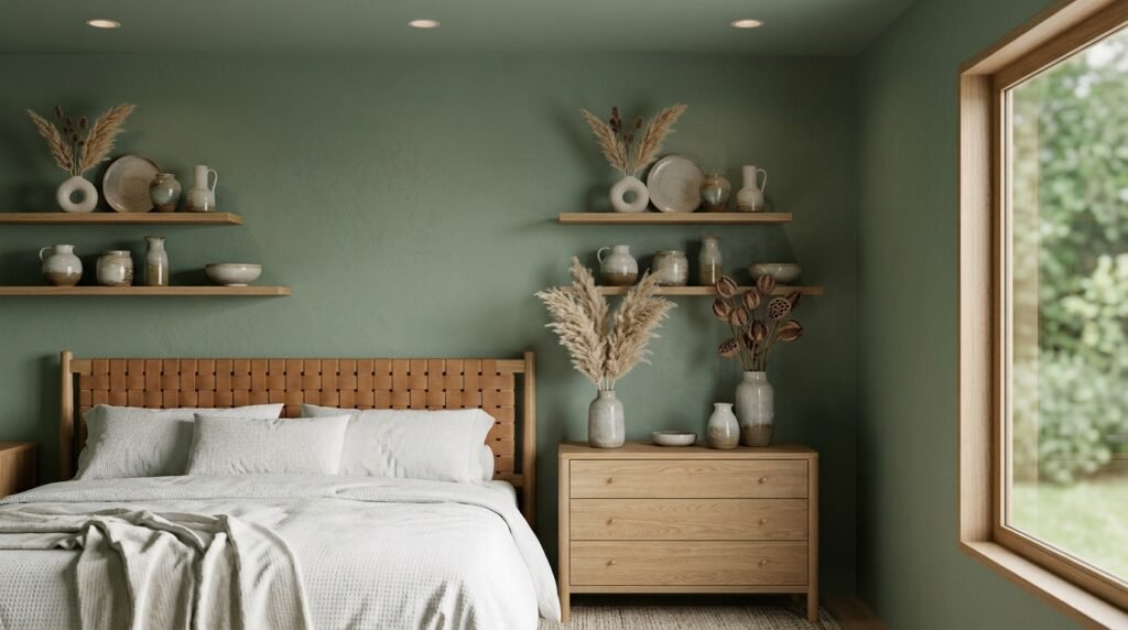
Sage green has become one of the most popular colors in modern interiors. Paired with natural wood, it creates an organic, relaxing atmosphere inspired by nature.
This palette feels fresh while remaining timeless and versatile.
Styling Tip: Use black accents sparingly for contrast.
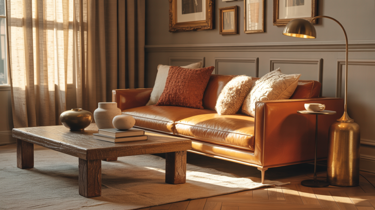
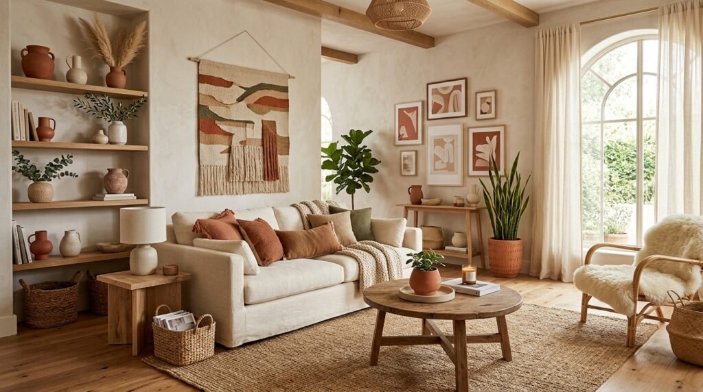
3. Terracotta and Cream
Terracotta introduces warmth and character while cream softens the overall look. Together they create inviting spaces that feel grounded and cozy.
Styling Tip: Add woven textures to enhance the earthy aesthetic.
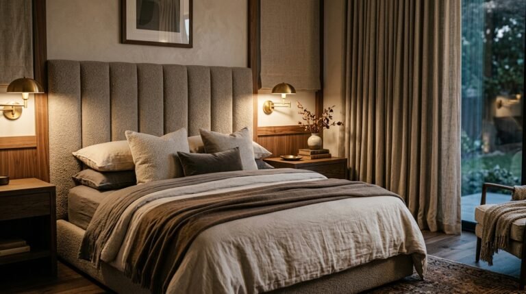
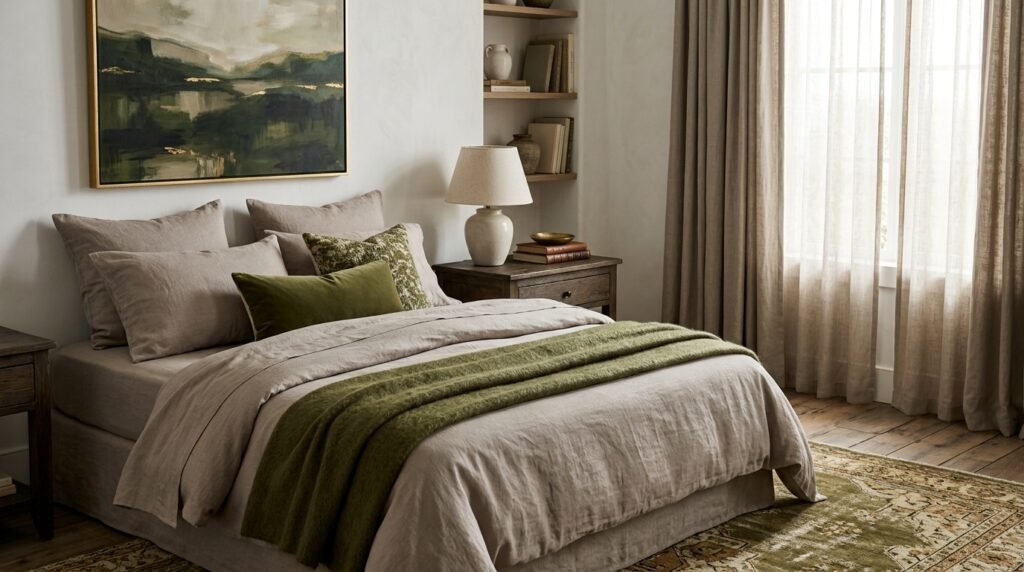
4. Olive Green and Warm Taupe
Olive green offers sophistication and depth while warm taupe keeps interiors balanced and approachable. This combination works particularly well in bedrooms and living spaces.
Styling Tip: Incorporate brass finishes for extra warmth.
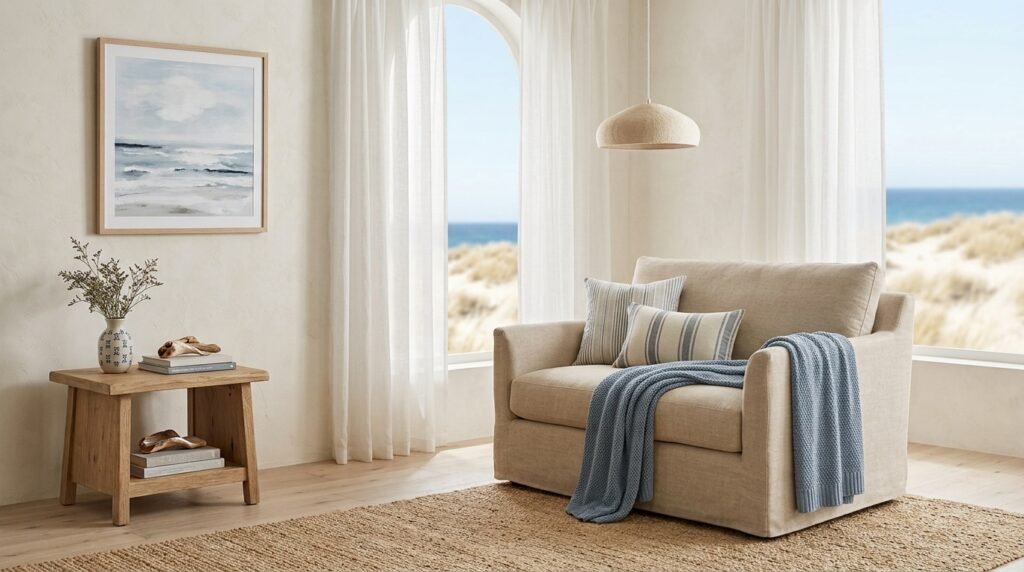
5. Dusty Blue and Sand
Inspired by coastal landscapes, dusty blue and sand create a relaxed, airy atmosphere. This palette feels fresh without becoming overly nautical.
Styling Tip: Add natural linen fabrics to reinforce the coastal feel.
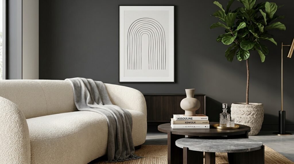
6. Charcoal and Warm Ivory
The contrast between charcoal and ivory creates a modern, elegant look. Darker elements add drama while lighter tones maintain balance.
Styling Tip: Use charcoal on furniture rather than walls for a softer effect.
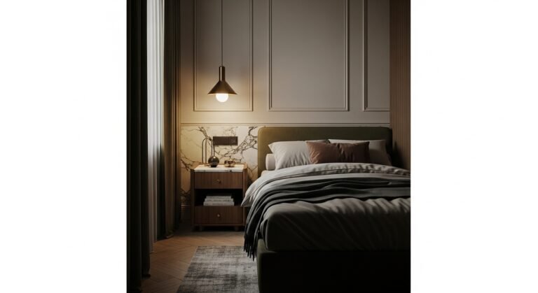
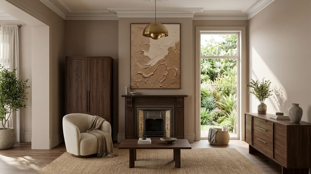
7. Mushroom Taupe and Walnut Brown
This rich neutral palette feels luxurious and timeless. Mushroom taupe softens interiors while walnut brown introduces warmth and depth.
Styling Tip: Layer textured fabrics for a designer-inspired look.
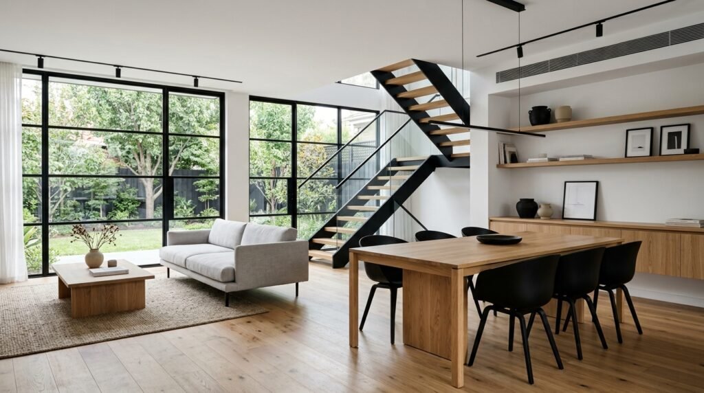
8. Soft Black and Natural Oak
Soft black provides dramatic contrast while natural oak keeps the palette grounded and approachable. This pairing works beautifully in modern interiors.
Styling Tip: Balance dark elements with plenty of natural light.
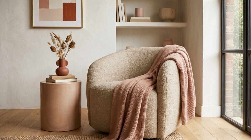
9. Clay Pink and Warm Neutrals
Clay pink offers a sophisticated alternative to traditional blush tones. Paired with warm neutrals, it feels earthy, elegant, and contemporary.
Styling Tip: Incorporate natural stone and wood finishes.
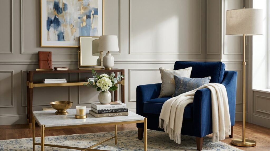
10. Deep Navy and Brass
Deep navy remains a favorite because it feels timeless and dramatic. Brass accents introduce warmth and sophistication while preventing the palette from feeling cold.
Styling Tip: Use navy as an accent color rather than overwhelming the room.
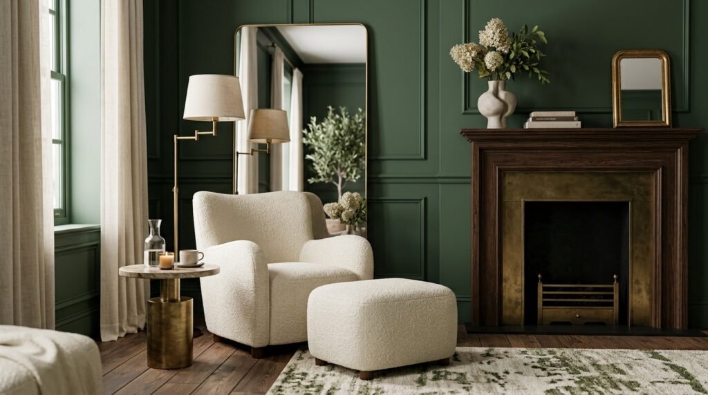
11. Forest Green and Cream
Forest green brings richness and connection to nature while cream softens the overall palette. Together they create a sophisticated yet comfortable atmosphere.
Styling Tip: Add wood furniture to enhance the natural aesthetic.
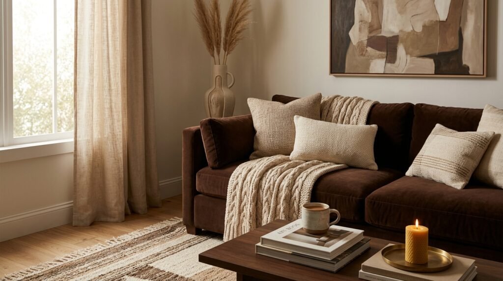
12. Chocolate Brown and Beige
Chocolate brown has returned as one of the biggest home decor trends. Combined with beige, it creates cozy and sophisticated interiors with incredible depth.
Styling Tip: Mix multiple shades of brown for a layered look.
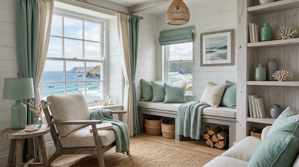
13. Seafoam Green and Driftwood Gray
This palette brings a subtle coastal influence while remaining modern and refined. Soft greens and weathered grays create a peaceful atmosphere.
Styling Tip: Use natural woven textures for added warmth.
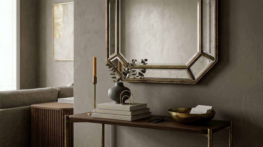
14. Greige and Antique Brass
Greige continues to be a designer favorite because it balances warm and cool tones effortlessly. Antique brass adds character and a touch of understated luxury.
Styling Tip: Pair with soft textures and natural materials for a timeless result.
Conclusion
Today’s most popular home decor color palettes share a common theme: warmth, comfort, and connection to nature. From earthy greens and rich browns to soft blues and layered neutrals, these color combinations create interiors that feel welcoming, timeless, and beautifully balanced.
Whether you’re drawn to modern organic spaces, coastal-inspired rooms, or classic neutral designs, choosing the right palette can dramatically influence the mood and style of your home. The best color schemes aren’t simply trendy—they reflect how you want your space to feel every day.
By incorporating one of these designer-approved palettes, you can create a home that feels current, sophisticated, and effortlessly inviting for years to come.